Case Study: Avène Redesign
Packaging
Professor David Wolske
Challenge
In this project, I was tasked with redesigning an existing brand and improving three key aspects: aesthetics, user experience, and sustainability.
My client was Avène Eau Thermale, a French skincare brand renowned for its products tailored to sensitive skin using the healing properties of Avène spring water. The challenge was to convey the brand’s clinical precision and soothing nature through the design.
Research
Through detailed research, I identified areas for improvement in the brand's design. Notably, Avène's products are significantly more expensive outside of France. This led me to reposition the brand as a luxury product to match the more expensive price point. I drew inspiration from Avène’s unique brand story; the "spring water" concept is integral to the brand's image, so I aimed to include it in the design.
Product Redesign
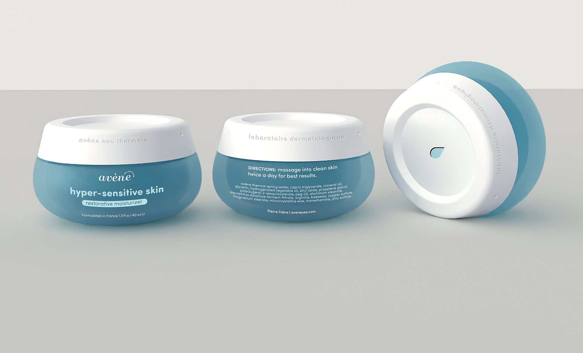
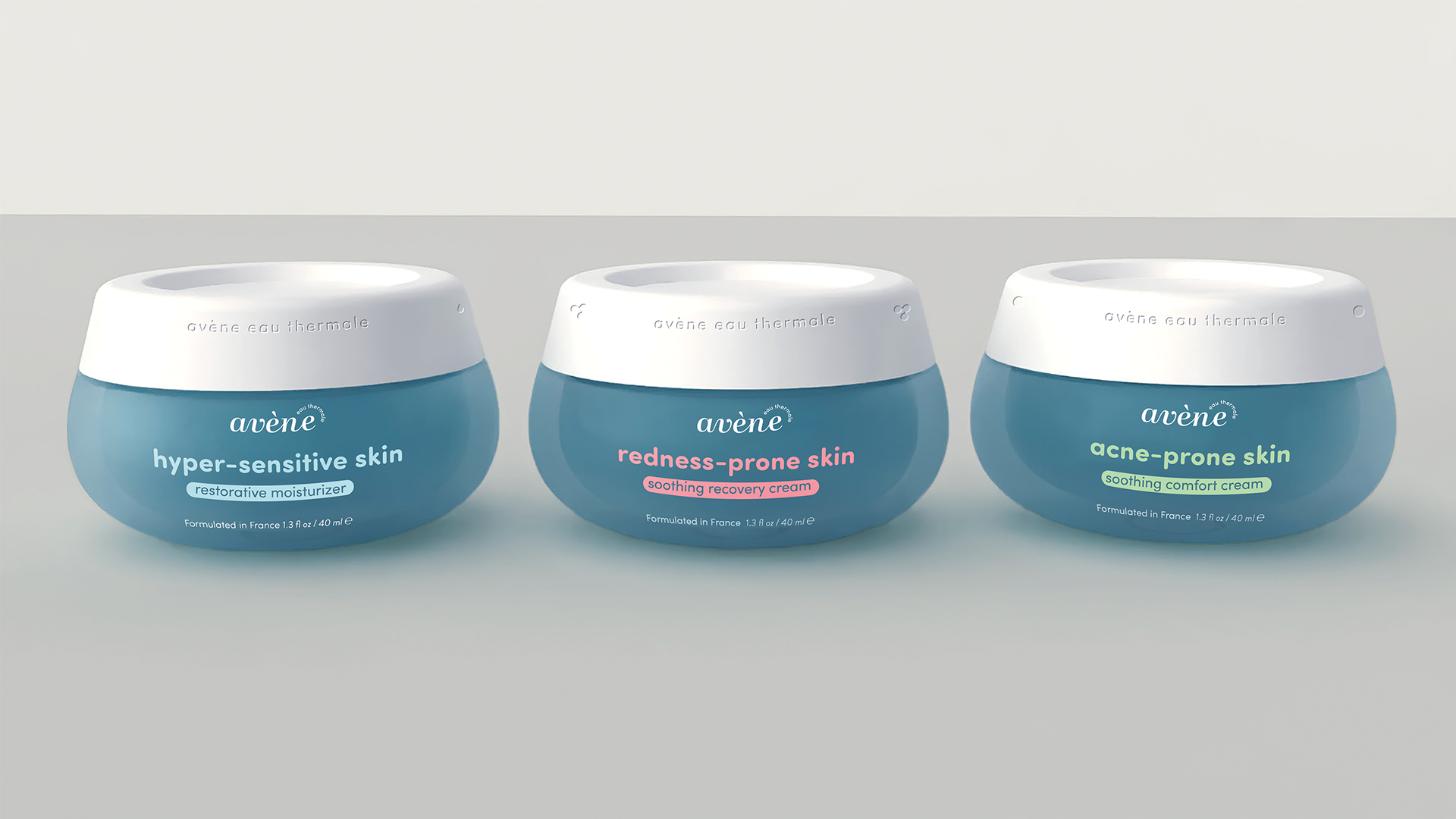
The new design aimed to communicate the soothing nature of Avène’s products, evoke feelings of relaxation and luxury, and highlight the concept of spring water. To achieve this, I use smooth, rounded shapes, visuals that mimic the color and texture of water, and small geometric elements.
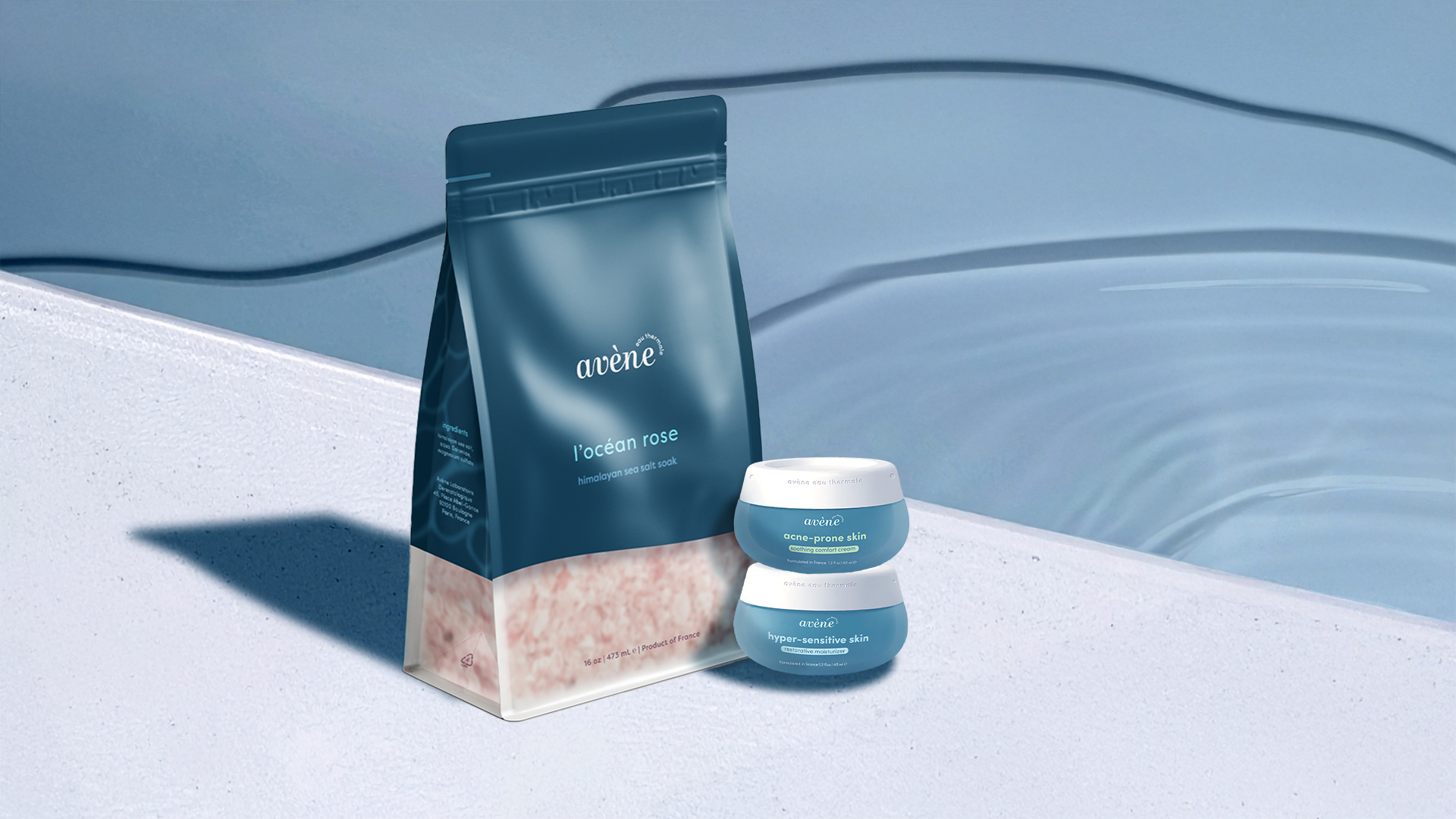
Product line Extension
I extended the new brand system to two other moisturizer products within the same product line. While maintaining the same design system, the products are differentiated using specific colors and icons.


Brand Extension
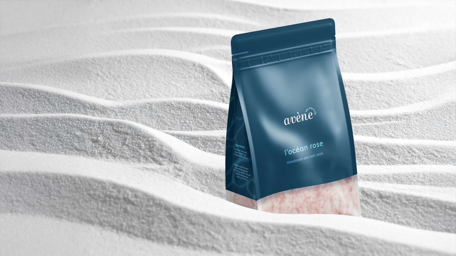
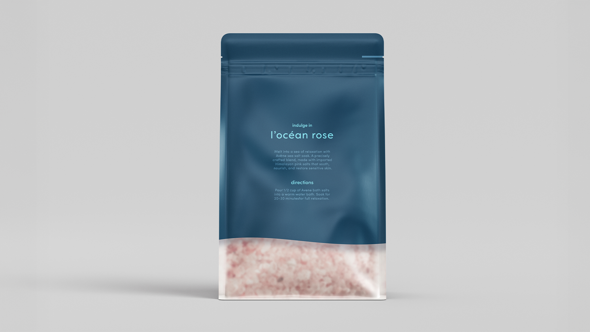
I further extended the brand to include a bath salt product. Bath salts are known for their relaxing and healing properties, which align well with Avène’s brand image. The luxury aspect was emphasized through the frosted look of the bag, the water pattern on the side, and the generous use of negative space.
Results
The resulting brand design visually reflects the core values of the brand Avène. It expresses not only the healing benefits of the product, but also the soft, soothing experience of Avène.